Community Corner
Time Map of the MBTA: Just How Long Is Your Commute from Malden?
A new map of the T shows not the geography of stations, but the time it takes between them.


If you've ever thought about moving to get a better commute, a new "time map" of the T might help you.
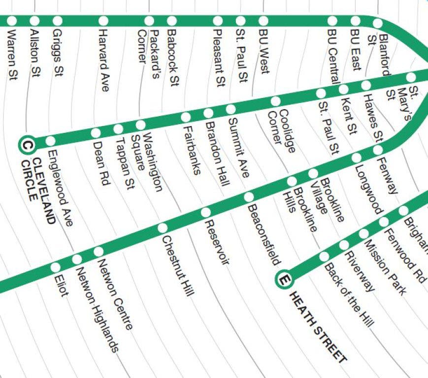
Designer Peter Dunn created a map of what the MBTA subway system would look like if it was plotted by time — not by geography.
For instance, a Malden Square resident trying to get to Downtown Crossing can expect about a 13-minute trip, according to the map.
Find out what's happening in Maldenwith free, real-time updates from Patch.
Here's some of what jumped out at Dunn when he studied his map:
Seeing all schedules in a single map shows that not all Green Line branches are created equal. It takes just as long to get from downtown to Boston College on the B line as it does to get to Riverside on the D line, despite being about half the distance. And even though they’re just a few blocks apart, Chestnut Hill Ave (B line), Cleveland Circle (C line) and Reservoir (D line) are 27, 20, and 14 minutes from Kenmore, respectively.
Find out what's happening in Maldenwith free, real-time updates from Patch.
As Dunn makes clear, the times used are averages — and official ones at that. In practice, trains get delayed, cars go out of service, and trains fill up.
If you want to zoom in to portions of the map, go directly to Dunn's website, where you can load a large-size version of the map.
Get more local news delivered straight to your inbox. Sign up for free Patch newsletters and alerts.